
Thursday 31 December 2009


i!BWk~%24(KGrHgoOKioEjlLme88sBKJmn2I!ug~~_12%5B1%5D.jpg)

(hHg!Wk~%24(KGrHqEH-DUEsJj-1lbvBLKuoN3UsQ~~_3%5B1%5D.jpg)
Tuesday 29 December 2009

Monday 28 December 2009
gBmk~%24(KGrHqYH-EQEsNqo,IdLBLL(VGQYyQ~~_12%5B1%5D.jpg)
wlqBrBLKZ)wK3D!~~_3%5B1%5D.jpg)
,Si!Bmk~%24(KGrHqMH-CMEsK43JK42BLKu1WPYS!~~_3%5B1%5D.jpg)

%5B1%5D.jpg)


Sunday 27 December 2009


Saturday 26 December 2009


ikg!2k~%24(KGrHqYH-C4EquiQBtyRBKyj36rVIQ~~_12%5B1%5D.jpg)


Thursday 24 December 2009
93JLBLM4V-nM2Q~~_12%5B1%5D.jpg)
Wednesday 23 December 2009
dFDCSBLKhQEsoZg~~_3%5B1%5D.jpg)


Tuesday 22 December 2009
typo-tastic Ried Miles

Design Icon: Blue Note
Reid Miles’s inventive use of type, moody photography and a minimalist colour palette helped Blue Note establish itself as the hippest of all jazz labels
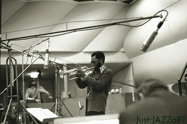
Blue Note Recordings: the name still resonates today. Synonymous with artistic flair, the label is a fading memory of jazz’s ‘golden age’. Yet for all its musical importance, Blue Note was equally significant in terms of design. Under Reid Miles, the label’s sleeves formed a cornerstone of the graphic design canon.
Established in 1939 by Berlin-born Alfred Lion, Blue Note was an American label founded on love for an American art form. Intent on capturing the performances, Lion teamed up with Francis Wolff to realise his dream. Wolff was an accomplished photographer, whose moody renditions of jazz’s top cats adorned many early Blue Note sleeves. It wasn’t until the appointment of Chicago-born designer Reid Miles in 1956, however, that the label truly found its graphic voice.
Lion and Wolff refused to compromise creativity, allowing pioneers such as Thelonious Monk free reign to explore jazz’s cutting edge. It’s fitting that Miles’s first notable sleeve was a Thelonious Monk reissue (pictured above). Exploding onto the scene, his bold hyphenation of ‘Thelo-nious’ broke all the rules, treating the syllables as visual building blocks. Blue Note quickly became Miles’s playground; a space to challenge himself, artists and the audience.
Interestingly, Miles preferred classical music to jazz, trading in his Blue Note sample copies and not even listening to the music. Given this, it’s amazing that Miles’s designs were so ‘tight’. As Felix Cromey writes in Blue Note: The Album Cover Art: “Miles made the cover sound like it knew what lay in store for the listener: an abstract design hinting at innovations, cool strides for cool notes, the symbolic implications of typefaces and tones.”
Distant style
Dutch designers Experimental Jetset are intrigued by this relationship, saying that it is, “interesting to see that a designer who really managed to capture the essence of his time, was also, in a way, disconnected from that very essence.” Adding that it is perhaps, “distance, not engagement, that makes the designer.”
This ‘distance’ is important, and allowed Miles to experiment. He “never settled into a typeface or system”, notes Richard Cook in Blue Note The Biography. Whatever form Miles’s designs took, they bore an unmistakable power. From Sonny Clark’s Cool Struttin, to Freddie Hubbard’s Hub-Tones, Miles, Cook says, “made sure that his sleeves were as heavyweight as the music inside.”
Blue Note is Miles for many, but a number of other designers, including Paul Bacon and John Hermansader, made notable contributions. Pop art god Andy Warhol even made an appearance, yet Miles’s Midas touch was predictably involved, having been behind the decision to commission Warhol to create the cover of Kenny Burrell’s 1969 Blue Lights LP.
Talented as Miles clearly was, his position was uncommonly fortunate. With unrestricted access to Wolff’s atmospheric photography, combined with artistic control bordering on autocracy, the elements for great design were in place. Add the skill of the performers, plus burgeoning record sales, and it almost appears as if Miles was home and dry before he’d started.
Miles ahead
While his designs certainly benefited from a sympathetic label boss and Wolff’s superb raw material, Miles added an unquantifiable element to the mix. Like his namesake Miles Davis, his absence was felt as much as his presence. It’s not that Blue Note was visually a one-man-band, but Miles was the prodigal soloist. He galvanised the greatness around him to create legend, transforming the constituent parts into genreredefi ning symphonies of fantastic form and colour.
Miles’s greatest achievement was the harmonious blending of modernism with a distinct personality. His greatest sleeves, such as Dexter Gordon’s Go, were unashamedly dynamic typographic treatments. For all his compositional flair, Miles also knew when to play hands-off, letting Wolff’s expressive photography drive sleeves such as John Coltrane’s legendary Blue Train. That’s why Miles’s sleeves fit so well; they visually represent jazz. At once personal and progressive, vernacular and global – reflecting the most human of artforms.
Blue Note was hit hard by the reinvention of jazz in the late 1960s and the label began to drift slowly away from the cutting edge. Dismantling began in 1967 with Lion’s retirement. A sale of the label to Liberty Records followed in 1969 and Wolff died in 1971. The new owners were bereft of invention, lacking the passion and the understanding that had informed the founders’ success. As the viability of jazz came under the spotlight, Blue Note retreated to the safety of ‘straight’ jazz, dispensing with Reid Miles in the process. Stripped of its creative heart, the label was dead in the water. Following a series of takeovers, it was strategically phased out under EMI in 1979.
New directions
Hope arrived with a 1985-label relaunch, signalling a number of reissues and new releases. The label has since regained some of its commercial success, with new artists such as Norah Jones shifting thousands of records. But in an era increasingly defined by artist – and agent – power, much of what the label stood for has inevitably been lost. As current label head Bruce Lundvall conceded to Texas’ Austin Chronicle: “People ask me, ‘is Blue Note what it used to be?’ I say no, it can’t be. All the covers were designed by Reid Miles, and they were great, but the artists didn’t have much say about them. [These days] every artist wants their own cover designer.”
Blue Note’s legacy is actually artistic patronage. The label’s success, and the achievements of Reid Miles, were made possible not just through Lion’s leadership, but through public support. It’s easy to look back nostalgically at the era, but there have been plenty of examples since – such as Malcolm Garrett’s 1970s work for the Buzzcocks, Vaughan Oliver’s covers for 4AD during the 1980s and labels such as Ai Recordings and Rune Grammofon, which ably demonstrate not only the importance of good cover design, but also inspire a widespread appreciative fan base.


Monday 21 December 2009


Sunday 20 December 2009
edlhg~~_12%5B1%5D.jpg)


Saturday 19 December 2009


Wednesday 16 December 2009


Tuesday 15 December 2009


,Si!Bmk~%24(KGrHqMH-CMEsK43JK42BLKu1WPYS!~~_3%5B1%5D.jpg)
ikg!2k~%24(KGrHqYH-C4EquiQBtyRBKyj36rVIQ~~_12%5B1%5D.jpg)
93JLBLM4V-nM2Q~~_12%5B1%5D.jpg)
Subscribe to:
Posts (Atom)